It is natural to compare the current housing boom to the mid-00s housing bubble. The bubble and subsequent bust are part of our collective memories. And graphs of nominal house prices and price-to-rent ratios look eerily similar to the housing bubble.
However, there are significant differences. First, lending has been reasonably solid during the current boom, whereas in the mid-00s, underwriting standards were almost non-existent (“fog a mirror, get a loan”). And demographics are much more favorable today than in the mid-00s.
And I suggested we compare the current situation to the 1978 to 1982 period, and I discussed a few similarities between the periods (no comparison is perfect):
- Demographics were similar
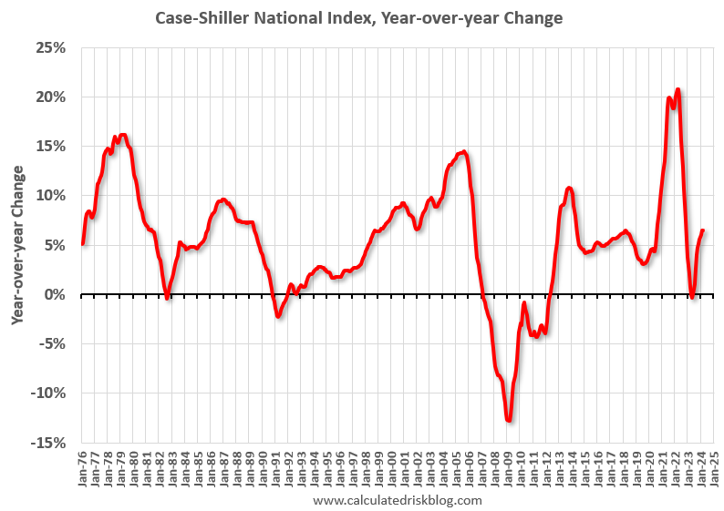
- House prices increased rapidly.
- Inflation picked up
- The Fed raised rates to bring down inflation.
- House payments increased sharply
Here is a review and a discussion of what this means for house prices.
Demographics were Somewhat Similar in Both Periods
This graph shows the longer-term trend for three key age groups: 20 to 29, 25 to 34, and 30 to 39 (the groups overlap). This graph is from 1960 to 2060 (all data from Census: current to 2060 is projected).
NOTE: This doesn’t include the recent pickup in legal immigration.
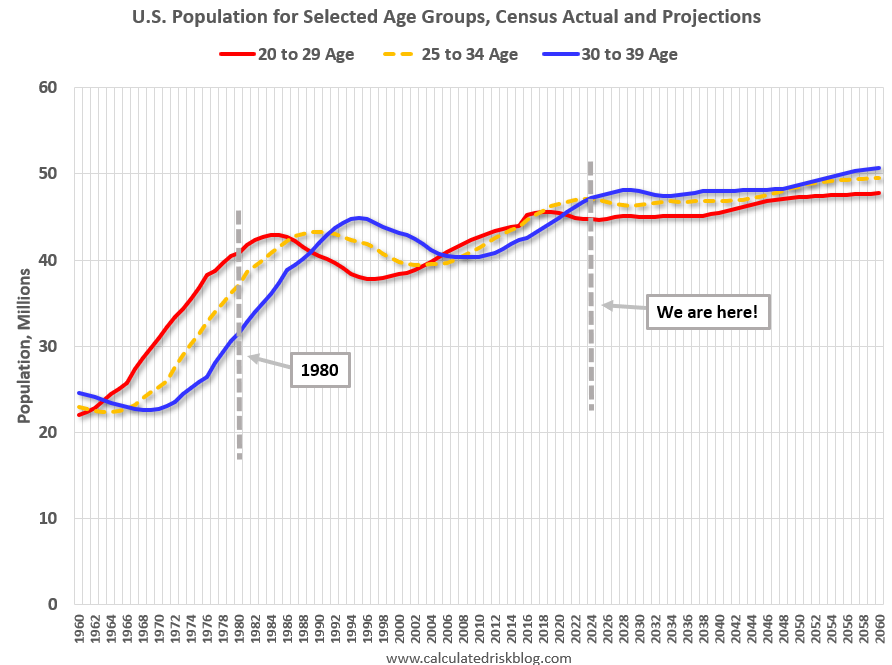
We can see the surge in the 20 to 29 age group last decade (red). Once this group exceeded the peak in earlier periods, there was an increase in apartment construction. This age group peaked in 2018 / 2019 (until the 2030s), and the 25 to 34 age group (orange, dashed) will peak around 2023.
For buying, the 30 to 39 age group (blue) is important. The population in this age group is increasing and will increase further over this decade.
When we look back at the 1978 to 1982 period, the 30 to 39 age group (blue) was increasing even more than today (supporting house prices).
House Prices Increased Rapidly
Inflation picked up
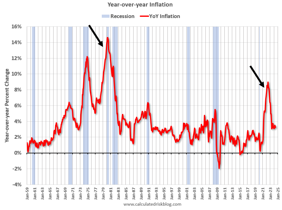
Note that inflation was already elevated prior to the oil shock in the late ‘70s. This time inflation picked up due mostly to the impact of the pandemic.
The Fed Raised Rates to Bring Down Inflation
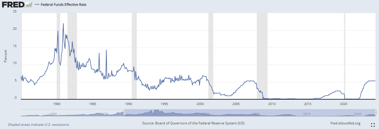
The effective Fed Funds Rate increased from around 6% in 1977 to over 17% in 1980. Recently the FOMC increased the Fed Funds Rate from close to 0% to 5.25%-5.5%.
House Payments increased Sharply
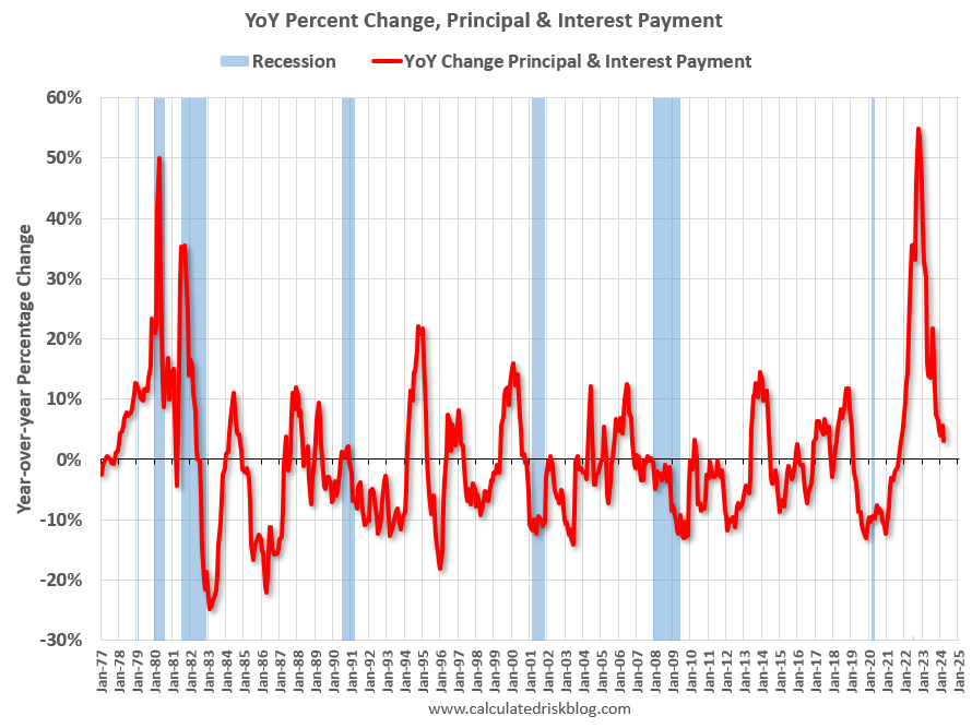
The following graph shows the year-over-year change in principal & interest (P&I) assuming a fixed loan amount since 1977. This measure of the YoY changes in P&I peaked at 55% in 2022 (this doesn’t take into account the change in house prices).
This is about the same percentage increase as in 1979.
The Implication for House Prices
In the 1980 period, nominal house prices only declined slightly according to the Case-Shiller National Index. However, real house prices (inflation adjusted) declined 13% from peak to trough, and it took over 7 years to return to the previous real peak.
If we use the Freddie Mac House Price index, nominal prices declined almost 7% from peak to trough in the 1980 period, and real prices declined almost 17%.
In the current period, national nominal prices are currently at a new high after declining about 2% from the peak in late 2022 and early 2023. Real prices are currently 2.2% below the previous peak and have been below the peak for almost 2 years.
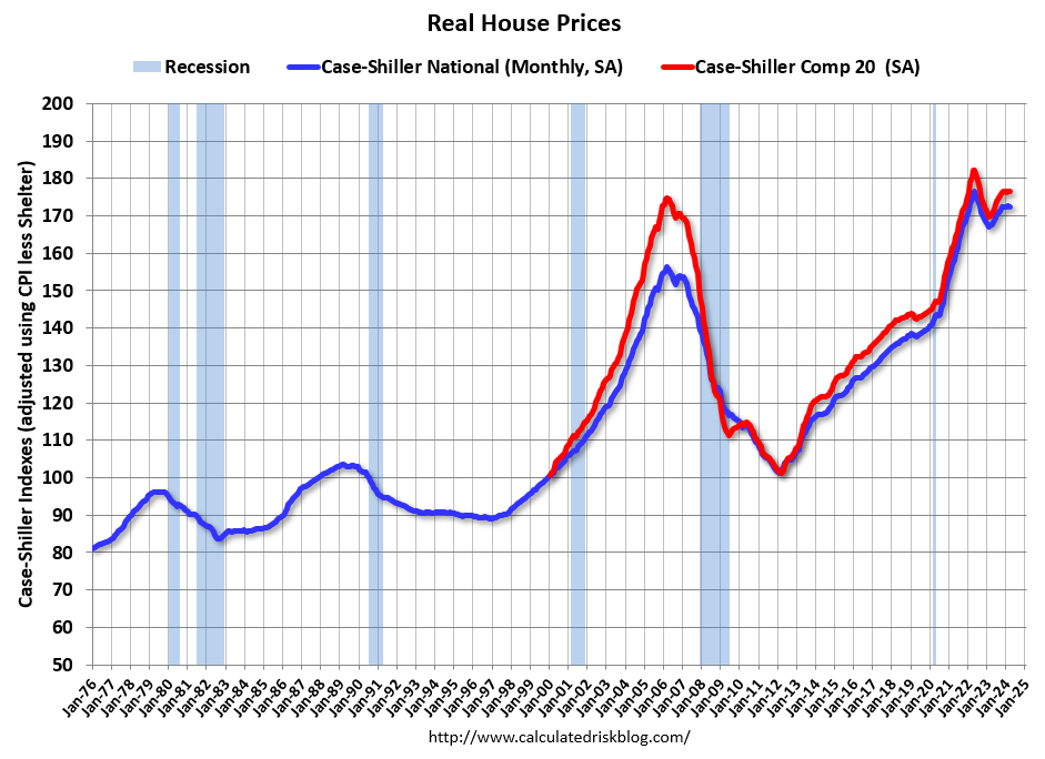
We might see some additional nominal price declines if inventory continues to increase (we are seeing some nominal declines in parts of Texas and Florida). And it was easier to see real price declines in the 1980 period since inflation was much higher.
We can be pretty certain we will not see a sharp decline in national prices since there will be few distress sales this cycle. Nor will we see sharp increase in prices with strained affordability. My expectation is that prices will follow a similar path as in the 1980 period.
This article was just to summarize some of the reasons why I’m looking to the ‘78 to ‘82 period for lessons, as opposed to the housing bubble.
